Tuesday, April 26, 2011

Ian's Trippy Colors

Before and After


There is a contrast in some of these photos. They all pretty much follow the rule of thirds. In the one where sulma is resting her head on the guitar has some harsh shadows on her face. With the photo of Abi and Alexa you will see in some places harsh and soft light. Over all I think there is pretty much good compisition.


Monday, April 25, 2011

Blur Streaks Tutorial

After:


For this tutorial I used tools such as the duplicate and transform tool. To get the picture to this tone of colors I had to desaturate it. I used the marque tool so make the streaks. The final composition has great contrast.


Before:


Wednesday, April 20, 2011

tutorial


Tiny Town


for this project i had to crop my photos. then i adjusted the contrast and brighnesson them. i had to rotate the pictures to make them line up good. it was hard to get them perfect because of all the wires.i changed the opacity on them to make them go together better.

Ian's Mography


before after

Monday, April 18, 2011


Well, I guess in a way there is some composition. There is a lot colour contrast. I thought about spherizing the photo, but it did not look good. I think there is a lot of variety inbetween each photo.

Pano

After cropping all the photos for the pano project, I decided to use the filter tool bar to edit some of the pictures. While editing, I decided to use adjustments on brightness and contrast as well. I also used tools like blurring the photos to try to make them come together with a different look.

IRENE'S PANO!

THIS IS MY PANO. IT IS A RESTARAUNT THAT I WENT TO ON SPRING BREAK IN OKLAHOMA. ENJOY :)


THIS IS MY PANO. I CHANGED THE EXPOSURE OF MY PHOTO BECAUSE ORIGINALLY THEY WERE TOO DARK. I ALSO USED THAT HARD LIGHT TECHNIQUE MRS. G. TAUGHT US. I MADE THE COMPOSITION OF MY PANO DIFFERENT BY OVERLAPPING PICTURES BUT NOT MAKING THEM LINE UP PERFECTLY. I ALSO LEARNED HOW TO APPLY AN ACTION TO MULTIPLE PICTURES. MY PICTURE HAS DIFFERENT AREAS OF FOCUS BECAUSE THERE ARE A LOT OF DIFFERENT AREAS OF INTEREST.

Abi's Panography!


For this project, composition was key. I had to pick a setting where there was a lot going on, so I chose Bloor Street in downtown Toronto. When taking the pictures, I knew I had to continuously press the shutter down to capture multiple pictures of the same thing, from different perspectives.

THE GRANDEST OF CANYONS PANO


For this project I changed the contrast and the brightness of the picture to improve the composition. I also used polar coordinates and spherized the photo to make it circular and different.

Ian's Pano


I went to the Wilderness in WI, this is part of the water slide the Toilet Bowl or the "Hurricane".


For this project I shot for panography, which is a bunch of photos put together to create one image. I used different zooms to create the look that some parts show more detail (or is closer) than others. To create the image I used the move tool to drag them together. Also I used the transform tool to change individual picture size. And to make less stuff to look at on my work space, I created new floders to group the layers.

~Ian M.

Olivia's Pano


For this project I used a lot of photoshop tools. Before assembling the pictures I changed the brightness and contrast. I changed the opacity on parts of the picture. I also changed the size and flips a few of the parts to fill all of the white space. The center picture is bulged. Nothing is totally centered to follow the rule of thirds.

panorama

For this project i changed the opacity of some of my pictures and had to overlap them to create the composition. I also had to change the size and distort some of the images to put them all together.

Friday, April 15, 2011

Panographys


I made my composition by incorporating different opacities, sizes, and tilts. There was a lot of duplicating to make sure I didn't lose an images spot. I had to overlap images to make them fit each other and the color tones don't necessarily match.


For the top two, I edited the image way they looked by sharpening the edges and distorting them.

Thursday, April 14, 2011

Visual Puns


For this project I used the patchy color tutorial, and the quick selection tool. I also changed the opacity and soft lights. I dealt with color contrast a lot as well.

Surreal


For this project a lot of editing was necessary. I used tools such as the quick selection tool, rotating, and black and white. I followed the rule of thirds in all my compositions. When I used the quick selection tool, it was essential that I refined the edges.

Monday, April 11, 2011

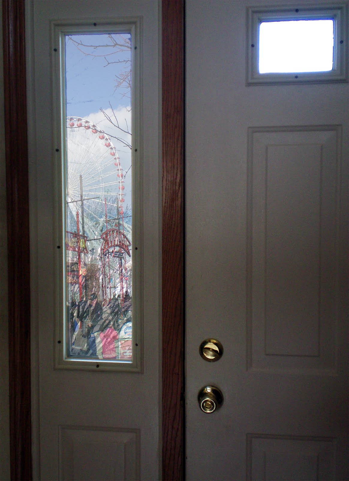
For this project I changed the contrast and brightness,because they had to match other pictures. i had to change the opacity slightly on some of them to make them look more natural. The picture in the water I made a reflection by turning the picture upside do.all of my photos follow the rule of thirds.