Deviled Egg
Headlines
Monday, February 28, 2011
Friday, February 18, 2011
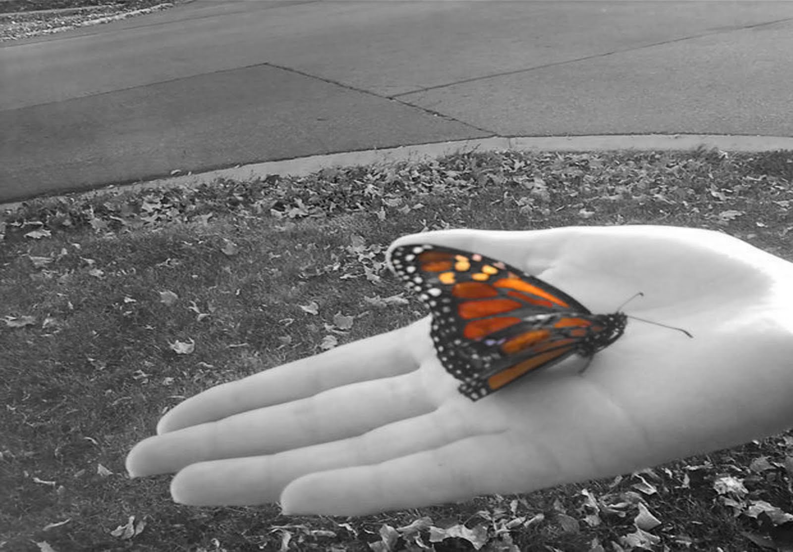
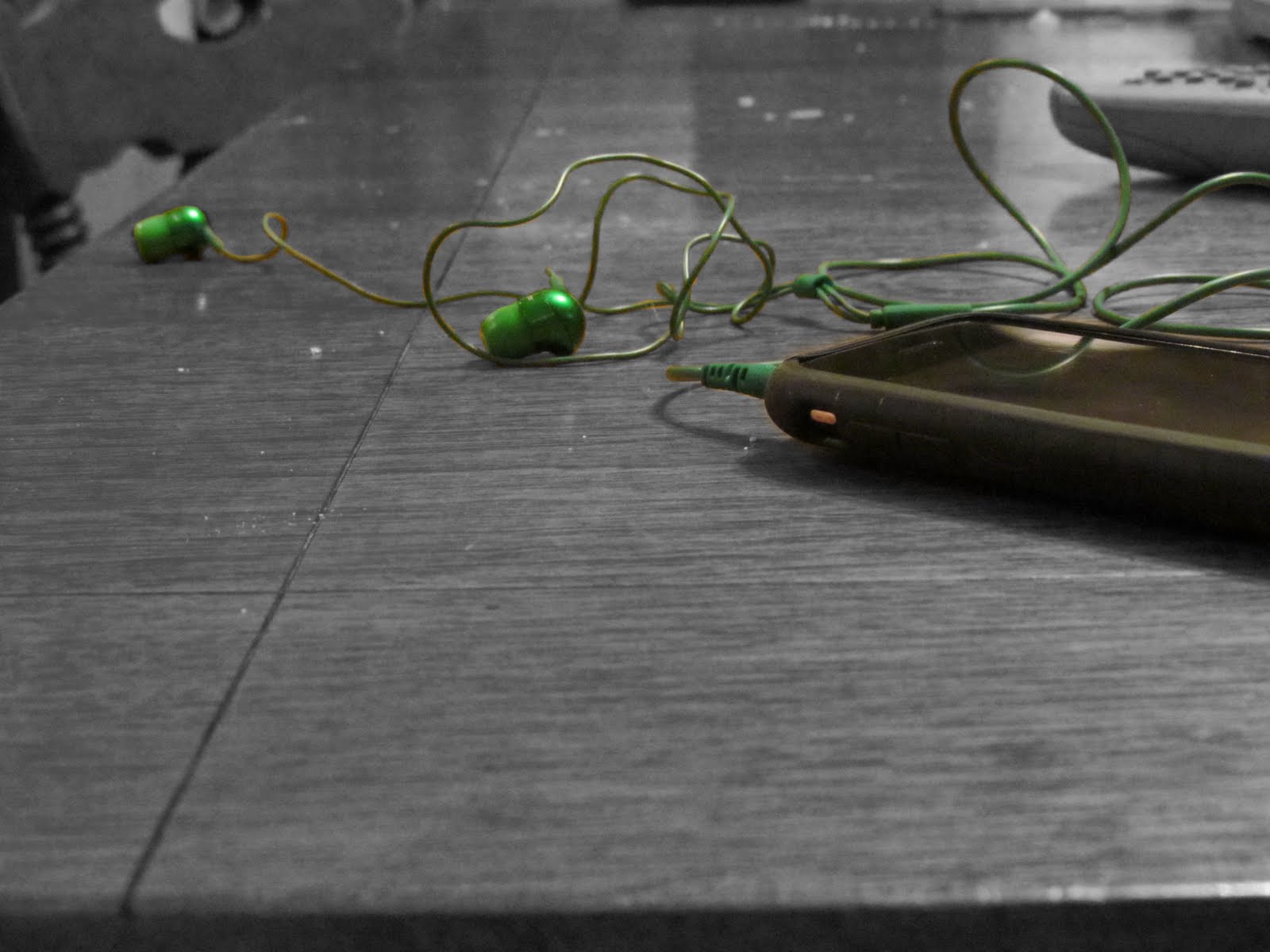
Color Emphasis Project

 For color emphasis you had to adjust the images to black and white, duplicate layers, & emphasize a color. These compositions have a lot of contrast and emphasis. The brush tool worked well to bring out the colors.
Double Negatives


For this project we had to create 4 double negatives. We had to take the pictures and make them look good together by changing the opacity. In my bottom picture I desaturated the light house layer and I increased the contrast on the layer under it. I also used the rule of thirds in all of my photos.
Irene's Color Emphasis
 In these photos, I used color emphasis to accentuate certain parts of the photo; this makes for a more interesting composition because there is one certain part that is the main focus of the viewer's eye. I used the rule of thirds when choosing what to color to make the photo more pleasing to the eye. Because of this, there is greater contrast.


Color Emphasis:Taylor


 For this I focused more on the contrast of each photo and masked it. By doing color emphasis it draws your attention to one thing but still keeping the rule of thirds in mind. I used the brush tool and also had to duplicate each layer changing the colors.
Double negatives


 In these pictures i used the rule of thirds to make the composition more interesting. I flipped some of the pictures horizontally or changed the color to emphasize or change how the picture looked.
Ian's Color Emphisis


I used color emphisis to draw the people's eyes to certain places in my pictures. For all but one photo I used duplicate layer's to bring out the origuinal color using a mask to color on. But for im remote picture i duplicated and added a layer so I could use the brush tool to change the original color to yellow blue and red. The color emphisis helps with the rule of thirds so your eye can see the focused area but realize the rest of the photo as well.
~Ian M.
Olivia's Color Emphasis


In order to emphasize an object I used the masking tool and I made an object in color. I followed the rule of thirds to improve the composition of each photo. The first photo shows contrast between the snow and the wood. The second picture shows depth of field with the rope and the road.
Thursday, February 17, 2011
color emphasis


 In this project I used color emphasis to emphasize part of the picture. I used rule of thirds and composition to make the picture more interesting.
Abi G: COLOR EMPHASIS


compostion, background, contrast
The use of masking was very important for this project. I tried to experiment using different techniques like fading the sharpies into the background. I also adjusted the contrast for the background so I would have an array of grays in addition to dark black and pure white. Choosing what subject to emphasize had a powerful effect on the composition overall.
Wednesday, February 16, 2011
Color emphasis


for this project you had to make the whole picture black and white by desaturating the top layer. Then you had to choose which parts of the picture you wanted to make colorful. I changed the contrast on my photos so that they would be brighter colors. Once i did that i then went back to the first layer and used the brush tool to put in the color. The pictures that i used all use the rule of thirds.
Taylor's Double Negatives


These are all double negatives. Each picture was desaturated and the contrast was changed on them. To form the pictures together I also changed the opacity on the photos to make them become one and also used the brush tool to for blending.


For this blog I uploaded my four double negative photos. This is when you combine two pictures by adjusting the opacity of the top layer photo. For my picture with the flower I also used a pic of my curtain to give the flowers a different texture. And for may of them I had to use the brush tool to fade the photos into eachother. Lastly, for this project I desaturated at least one picture (layer) to bring out the other.
~Ian M.
Olivia's Double Negatives


Most of my pictures have a similar composition because I used the same picture a few times. I used the city of Barcelona or Rome in four of my double negative photos. To create balance within each photo I took another picture and put it in the sky. The picture with the two cities is reflected to create symmetry. I changed the opacity of the pictures to have each picture blend with the sky. One picture shows contrast between the lights in the sky and the dark city.
Subscribe to:
Comments (Atom)